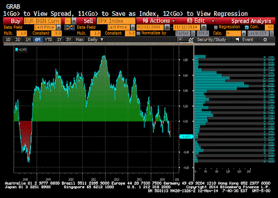
Look at what is happening to the correlation between the euro dollar exchange rate and equities.
These Great Graphics were created on Bloomberg. The first one shows the rolling 60-day correlation of the returns of the euro and the S&P 500. This is found by running the correlation on the basis of the percent change of each.
There is an inverse correlation. A weaker euro is associated with an advancing S&P 500. That inverse correlation is not particular statistically significant at almost -0.20. However, the correlation is the most inverse since 2008. The correlation peaked in 2011 just below 0.90.

Using the same methodology, this second chart shows the correlation between the euro and the German Dax. The euro is also inversely correlated with the Dax by the most since 2008. Currently the inverse correlation of nearly 0.40 is twice that of the S&P 500.
Moreover, the inversion began in May 2013. The exception was the March-May period when it moved into a positive correlation. Against the S&P 500, the inverted correlation was the exception.
For the record, the S&P 500 and the DAX correlation is around 0.5 now. Over the past decade the correlation has been between about 20 and 80. The correlation has surpassed 0.8 four occasions over the ten years. Over the last two years,it has been largely confined to a 0.4 and 0.7 range.
Great Graphic: Euro and Stocks
 Reviewed by Marc Chandler
on
November 13, 2014
Rating:
 Reviewed by Marc Chandler
on
November 13, 2014
Rating:


